new-theme-images-spec
Launchpad Entry: spec:new-images-plymouth-lightdm-wallpaper
Created: ScottLavender
Contributors:
Packages affected: ubuntustudio-default-settings, ubuntustudio-artwork
Summary
Create the following new thematically linked images to give Ubuntu Studio a more polished and consistent look.
- plymouth theme concept image
- lightdm greeter theme concept image
- desktop wallpaper image
'concept image' is listed for the plymouth and lightdm greeter themes because it the will consist of multiple elements rather than a static image. Please keep in mind, unless you are able and willing to help with the coding please do not get too crazy with the concepts ![]()
Release Note
The users will be presented with a new consistently thematic images throughout the starting, logging in, and using Ubuntu Studio. It will give a more polished and engineered look and feel to Ubuntu Studio.
Rationale
The current images are either disparate or crudely ugly (default lidghtdm theme currently used).
Assumptions
This specification is based on five assumptions:
- Users who see thematically related images during booting, logging in, and usage will consider Ubuntu Studio a better engineered product.
- The overall thrust of all concepts and images should be of simplicity.
- The base color should be a form of gray to follow with the rest of the theme
The first assumption is that the person(s) responsible for art will NOT be explicitly responsible for implementation or code. If you want to help in these regards, please do so, but they are not required. Others already involved can do the coding and implementation (within reason) but not create the artistic images desired.
- The creation of the images will be an iterative process. Filtering the minimalistic (and perhaps abstract) directions/guidelines though the artists interpretation most likely will require further discussions.
Design
Overall Concept
Here are some simple guidelines about the overarching concept:
- make sure there are consistent thematic elements in all images (e.g. colors, images, possibly positions)
- not every element or thematic concept needs to be included in every image (e.g. CoF might be located differently or even excluded in different images)
- if possible, riff off of the concept of "permanence" (it is an LTS version), "strength", or "reliance". Perhaps like stone or granite, which plays nicely with the suggested color of gray.
- Gray is the preferred overall tone for colors
- and most importantly: KISS - simplicity is beauty (plus it should make implementation easier)
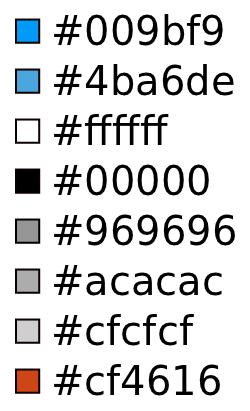
Suggested Colors
Below are the suggested colors. Previously we used lots of blacks and blues, but more grays might align better with the new xubuntu based theme.
NB: the heavy use of blacks and blues is highly discouraged, but the prevalent use of gray is encouraged.
Here is a list suggested colors. You don't have to use all of them ![]()

You might have noticed the crazily-lacking-continuity orange in there. It was inspired by this page which will feature later on and might have a good contrast against gray for the CoF or other elements (or might not as the spec writer is not a graphic designer).
CoF
Here is a .svg for the base CoF file. new-precise-images-logo.svg
It looks like the image from the developer.ubuntu.com website, but this is the only image that can currently be found that has the Ubuntu Studio CoF as separate parts to be manipulated.
Feel free to play around with the CoF. In the .svg linked above it was changed to orange and dotted lines. Of course, you don't have to include the CoF in the concepts or images, but it might be nice to include it in at least one of them.
If it helps anyone, the Ubuntu Studio CoF are sound waves.
Logo
This is the current version of the logo:
ubuntustudio_v3_logo.svg (right click -> save link as)
And an alternate version was developed as well:
ubuntustudio_v3_logo-alt.svg (right click -> save link as)
The font used for 'ubuntu studio' is Ubuntu.
Plymouth
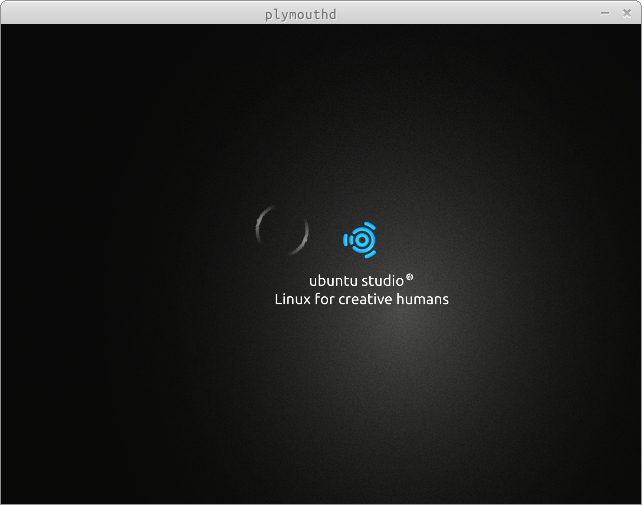
The current Ubuntu Studio plymouth theme only uses a "circling" animation around the CoF to denote activity. Note the plymouth-x11 plugin did not render the "circling" animation correctly.

Try to keep the animations simple. Remember, if you are willing to help code it then feel free to make it whiz-bang, but otherwise let's keep it nice. And please do not use a progress bar for animation.
Also, please do not include release number or code name.
Suggest using gray or dark gray as background, fairly homogeneous and non-distracting. Relatively smallish CoF might be used located close to center of the screen. Also, please at least include "Ubuntu Studio" and might even put in "linux for creative people".
But feel free to play around with elements and locations.
Background images not really envisioned for this, but if you have something awesome then show it.
Movie of existing theme, again note the plymouth-x11 plugin did not render the animation correctly:
Lidghtm Greeter
Simplicity is the watchword. Please don't overcomplicate or over-burden it with elements.
Gray (again) is suggested.
CoF might be excluded from this concept or image. Or perhaps made very large but moved off the screen mostly so that only the top-left quarter (or less) of the CoF is visible.
Might also include "graph dots" as part of background similar to https://docs.google.com/document/d/1MT5Qrouudu9EftJdbtuz-Z1l26bDUDlcpPD52YsABYM/edit?hl=en_GB
Backgroud images more acceptable for this concept and images, but please don't use something too busy and distracting if used.
Desktop Wallpaper
If the other concepts or images were simplistic, then this on is shockingly sparse. The concept for this desktop is avoid getting in the users way. It should just be there, where no discernible element draws attention but would be missed if absent. The desktop isn't to be a eye candy it is to provide a functional platform that gets out of the user's way to create.
If possible: simple but elegant, sparse but functional. (the spec writer realizes this is ambiguous and vague mumbo-jumbo).
Gray is suggested. Use something that will not distract or obscure icons on the desktop. The first image on this wiki page is similar to what is desired but bordering on being too "noisy". A more homogeneous look would be preferred.
Background images are actively discouraged for this wallpaper.
CoF is encouraged as the only branding. Suggestions include:
- showing small-ish CoF in bottom right corner, but almost as a ghost (remember, don't distract)
- showing small-ish CoF in bottom right corner, but as "etched" or chiseled into "stone" (like previous link)
- largish CoF which is centered off screen so that only portion of top-left is visible (again, try to make it non-distractingly present)
Implementation
The general idea is that the artists will create the concepts or images. The Ubuntu Studio project leader or art director will review and provide feedback.
Rinse, repeat a few times.
And the general idea is that the Ubuntu Studio project leader, art directory, or team will implement the images into the correct packages.
Test/Demo Plan
TODO
Unresolved issues
Well, at this point it could be suggested that most issues are 'unresolved' ![]() But hopefully we are working towards resolving most of them quickly though
But hopefully we are working towards resolving most of them quickly though ![]()
UbuntuStudio/new-theme-images-spec (last edited 2011-12-09 01:53:31 by lfkn-adsl-dhcp-64-92-16-215)