UIStyleGuide
|
Size: 2511
Comment:
|
← Revision 11 as of 2008-08-06 16:30:09 ⇥
Size: 2521
Comment: converted to 1.6 markup
|
| Deletions are marked like this. | Additions are marked like this. |
| Line 10: | Line 10: |
| '''A detailed description of the goals and guidelines have been compiled in the''' [attachment:MID%20Application%20UI%20Design%20Guide.pdf MID Application UI Design Guide.pdf] | '''A detailed description of the goals and guidelines have been compiled in the''' [[attachment:MID Application UI Design Guide.pdf|MID Application UI Design Guide.pdf]] |
| Line 20: | Line 20: |
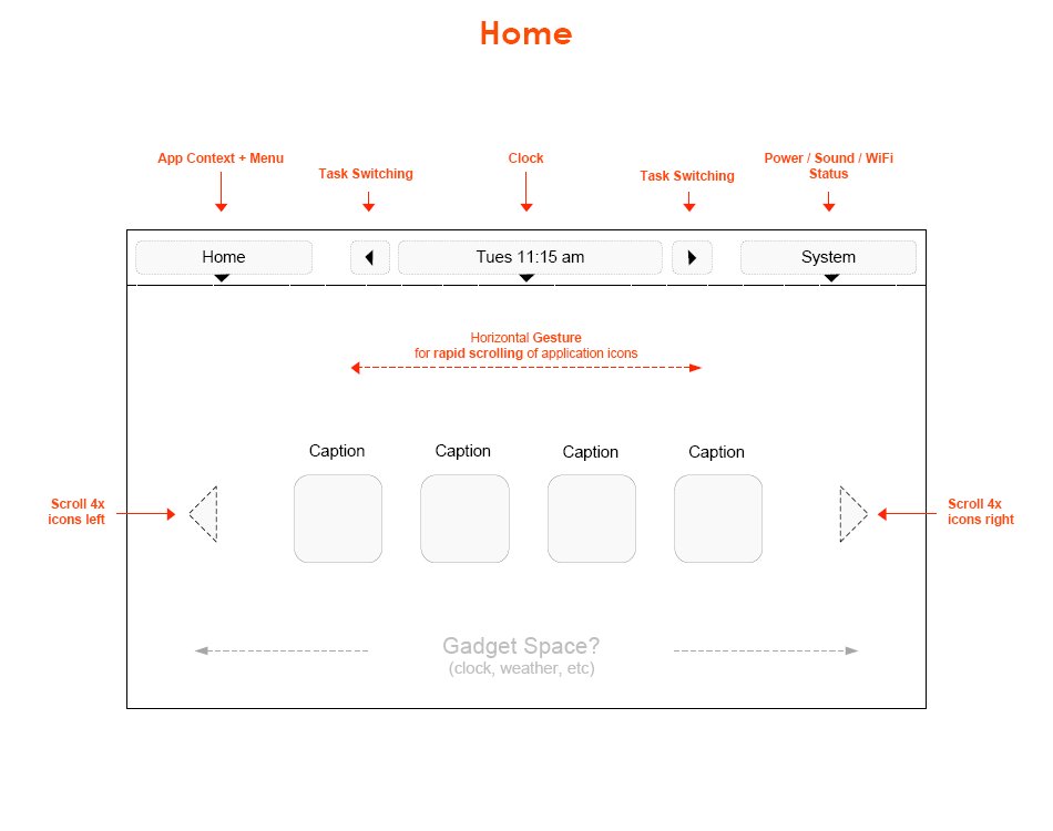
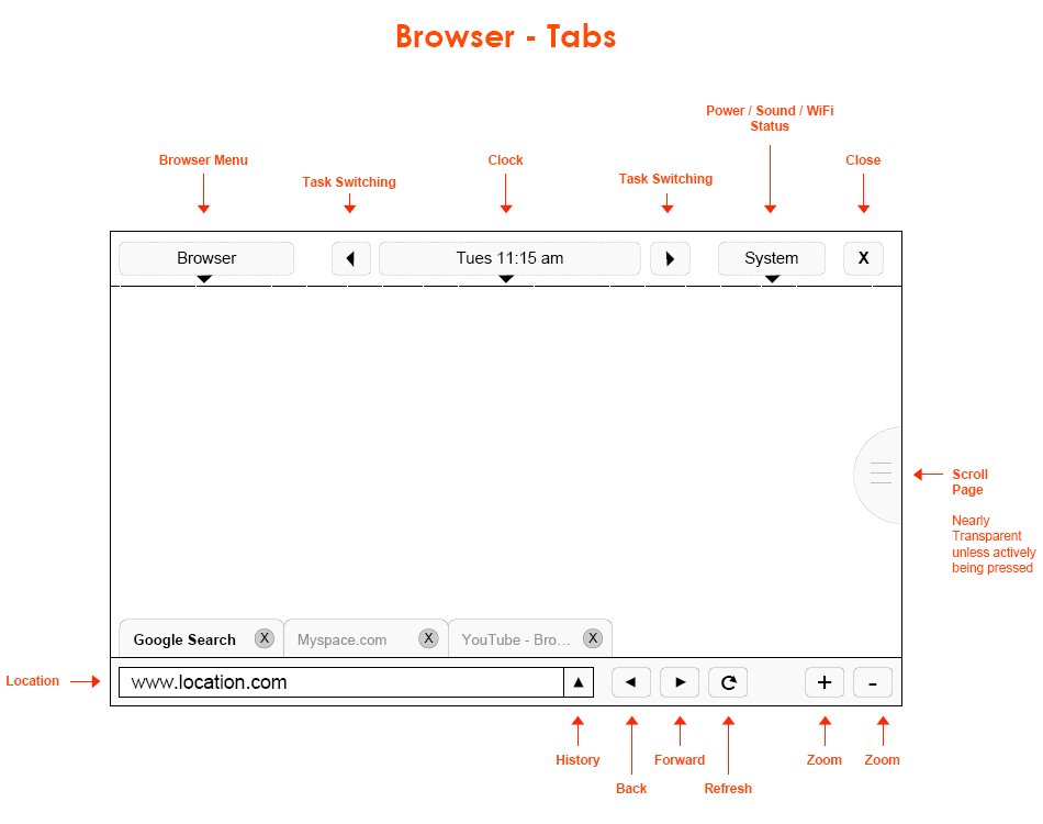
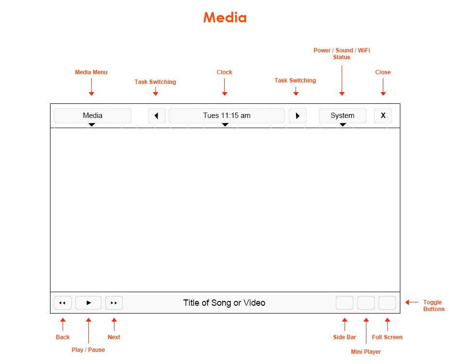
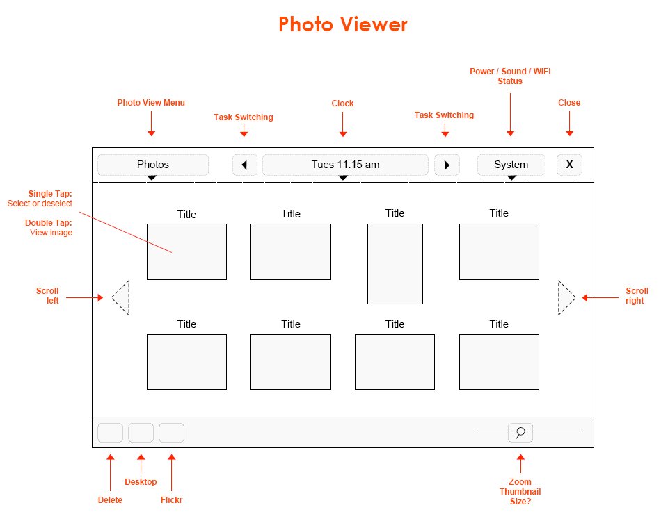
| Some simple wireframes of applications show the general idea for finger navigation and simplicity:[[BR]] attachment:mid_wireframe_home.jpg attachment:mid_wireframe_browser.jpg attachment:mid_wireframe_mediaplayer.jpg attachment:mid_wireframe_photoviewer.jpg |
Some simple wireframes of applications show the general idea for finger navigation and simplicity:<<BR>> {{attachment:mid_wireframe_home.jpg}} {{attachment:mid_wireframe_browser.jpg}} {{attachment:mid_wireframe_mediaplayer.jpg}} {{attachment:mid_wireframe_photoviewer.jpg}} |
| Line 33: | Line 33: |
| MikhailSobolev: did you consider having 'scroll buttons' on the same side? For one hand usage this set up would more appropriate. It could be an option (either global or applicatin specific) to show it like it's presented now, or both arrows on the left, or both arrows on the right.[[BR]] | MikhailSobolev: did you consider having 'scroll buttons' on the same side? For one hand usage this set up would more appropriate. It could be an option (either global or applicatin specific) to show it like it's presented now, or both arrows on the left, or both arrows on the right.<<BR>> |
| Line 36: | Line 36: |
| SergeMatveenko: why double tapping? it's not very usefull. Why do you ignore long tap? Long tap is more friendly for one hand usage especially for mobile "on the go".[[BR]] | SergeMatveenko: why double tapping? it's not very usefull. Why do you ignore long tap? Long tap is more friendly for one hand usage especially for mobile "on the go".<<BR>> |
Please check the status of this specification in Launchpad before editing it. If it is Approved, contact the Assignee or another knowledgeable person before making changes.
Launchpad Entry: mobile-ui-style-guide
Packages affected:
Summary
A detailed description of the goals and guidelines have been compiled in the MID Application UI Design Guide.pdf
This spec proposes a simple and consistent UI design for mobile device applications. It is intended to provide background on the types of devices being targeted and set expectations for consistency across applications.
Rationale
Applications running on mobile devices will need to be designed for finger-navigation, simplicity, and small screens. In addition, it is highly desirable to create consistency across applications.
Design
Some simple wireframes of applications show the general idea for finger navigation and simplicity:


Implementation
N/A
Outstanding Issues
BoF agenda and discussion
MikhailSobolev: did you consider having 'scroll buttons' on the same side? For one hand usage this set up would more appropriate. It could be an option (either global or applicatin specific) to show it like it's presented now, or both arrows on the left, or both arrows on the right.
BobSpencer: Good idea. Having things together would be nicer, esp if holding the device in the left hand.
SergeMatveenko: why double tapping? it's not very usefull. Why do you ignore long tap? Long tap is more friendly for one hand usage especially for mobile "on the go".
BobSpencer: I don't know about double tapping. We are currently following the Hildon pattern of select and activate (kind of double tapping, if this is what you are referring to). Long tap...does that mean tap-and-hold? Tap-and-hold is for right-click functionality. Perhaps I misunderstand.
HansPeterKlett: I wonder about having horizontal scroll gestures above what you're scrolling (for Home). Does anyone else visualize someone trying to awkwardly wrap their hand around the top of a device? I'm not active here, but I stumbled upon this and it seems worth mentioning.
MobileAndEmbedded/UIStyleGuide (last edited 2008-08-06 16:30:09 by localhost)